A few days ago our family laptop was upgraded to Windows 10, coming from Windows 8.1. Let’s have a look how well it works…
I was really looking forward to Windows 10, since it was said that many strange Windows 8 features (that I wasn’t really fond of) would be reverted, and because there would be new features. (Virtual desktops! Yay!) However, I was quite disappointed after I had tried it.
Bugs
I didn’t really search for bugs; I bumped into several problems however. Cortana sometimes asks for your attention, but something isn’t quite right there.

(By the way, Cortana had already asked me for my name, and I really just entered Willem.)
In general Cortana seems confused about interface texts. I have the feeling that translatable strings are mixed up somewhere.
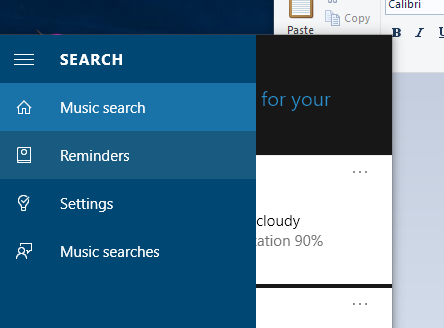
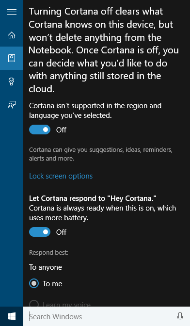
This also makes it rather hard to configure Cortana. In the settings panel all strings seem to have shifted one place.
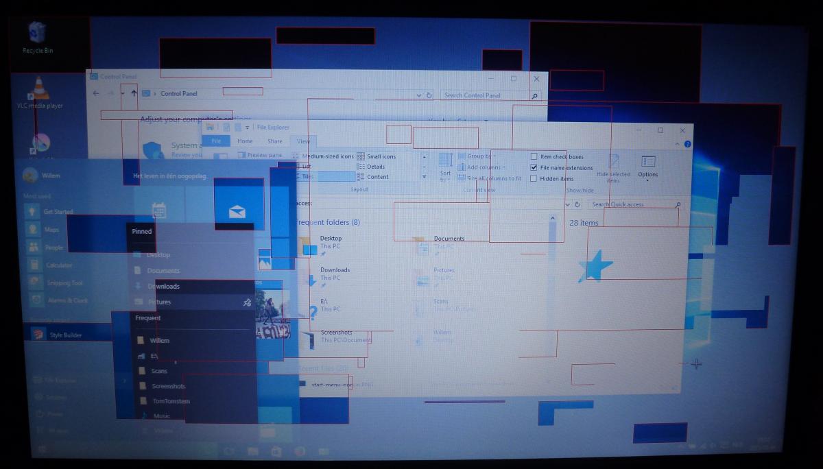
The nastiest bug I saw was – ironically enough – in the Snipping tool that I used to make screenshots of the Start menu for this article. The problem seemed to be that the Start menu was supposed to open on the foreground, and the overlay of the Snipping tool tried to also open on the foreground. I couldn’t even open a task manager window to kill the Snipping tool. Finally I needed to log off my session and log on again to solve it.
Inconsistency
We should take into account that Windows 10 was only released one week ago. I suppose that the bugs I mentioned will be solved quickly. What I dislike much more about Windows 10 is that it is not consistent. In fact, not at all. The system doesn’t feel like one thing: it seems like programs were created by separate teams that used completely different design guide lines – oh yeah, that actually was the case! Some programs are still ‘old-fashioned’ applications with a normal desktop interface, while some programs look like the Metro apps from Windows 8, but then put inside a window.
Let’s start with the File Explorer. Clicking with the right mouse button on a file results in a popup menu.

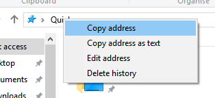
But for some incomprehensible reason you get a menu that looks completely different when you click the path name instead of a file.
And when you open a dropdown menu in the ribbon, you get a different one again. (Even the text rendering is different!)
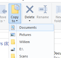
And that was all in the File Explorer – a normal desktop application. If we look at a Metro application, we see a completely different type of menu.
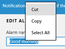
The shell also has its own share of popup menus, for example when clicking an item with the right mouse button.
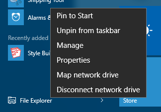
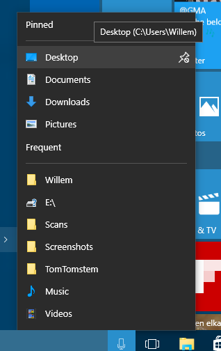
Or when you click the little arrow behind File Explorer to open a sub menu. (It is very similar to the previous one, but for some reason this menu has a subtle shadow, and the other one doesn’t. Also, the font is a bit smaller.)
Different topic: the system settings. Apparently, Microsoft thought it would be a good idea to make a Metro-style application for the settings. Okay, I understand that. But why did they leave the old desktop application in as well?
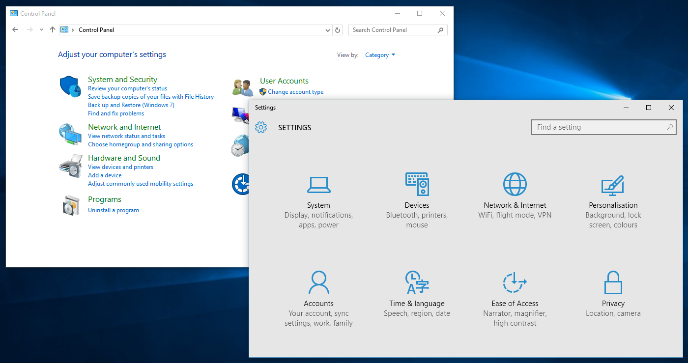
Most stuff is configurable in both versions…
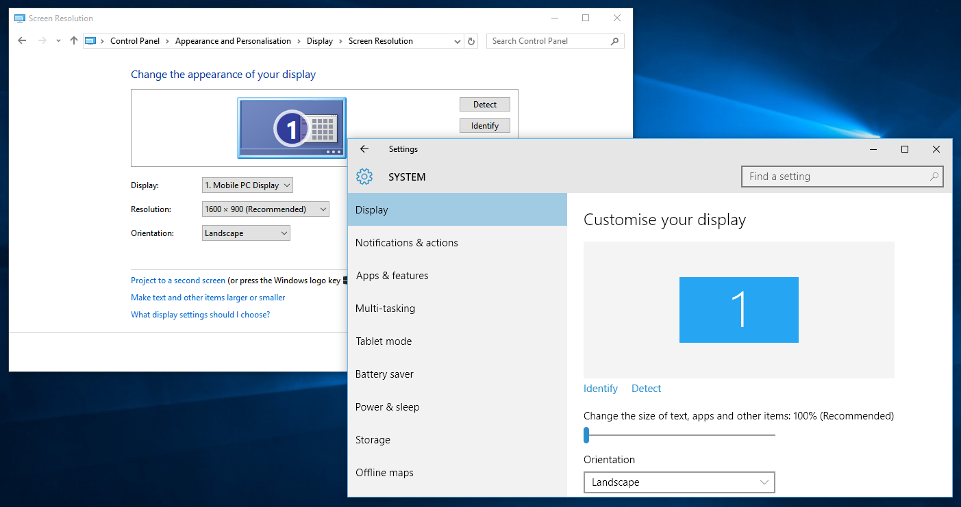
… but not all of them, like the window theme – you can only change that in the desktop version. And the privacy settings are only in the Metro version. Why? No idea. And then they think it’s strange that people can’t find stuff, right?
I’ll stop here, although I could go on for ages about things like these. My opinion is probably clear by now, namely: I’m in a state of total confusion about why Microsoft thought that it would be a good idea to throw consistency out of the window.